Infographics + Data Visualizations


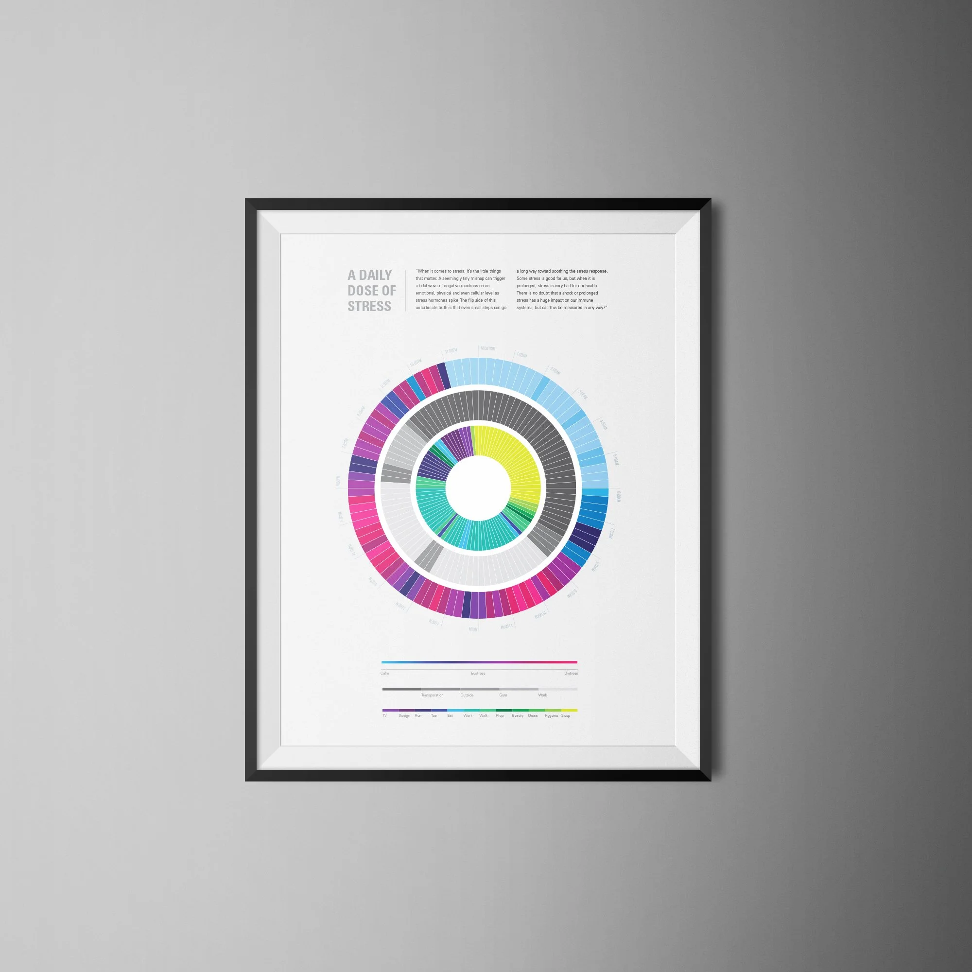
This was a graduate school assignment to test our comfort zones. I usually prefer simple, modern design to illustrate heavy clusters of information. This was a challenge in three stages to see how detailed I could get without overwhelming the design or more importantly, losing the intent of the graphic. By layering the design with content, I was forced to think of a system that maintained my love of clean design while offering relevant, insightful data.


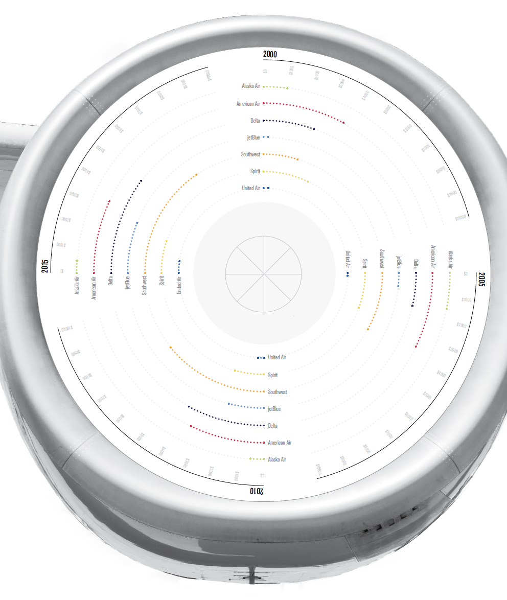
This is an interactive data graphic (Interactive PDF) that is based on mass amounts of quantitative and qualitative research in order to create a concise and effective story. Data had to be scraped manually and with assistance from online tools. The challenge lied in deciphering which aspects of data were important enough to use in the final design. This graphics depicts where each airline spends its money and what aspects of air travel require the most out of consumer’s pockets.


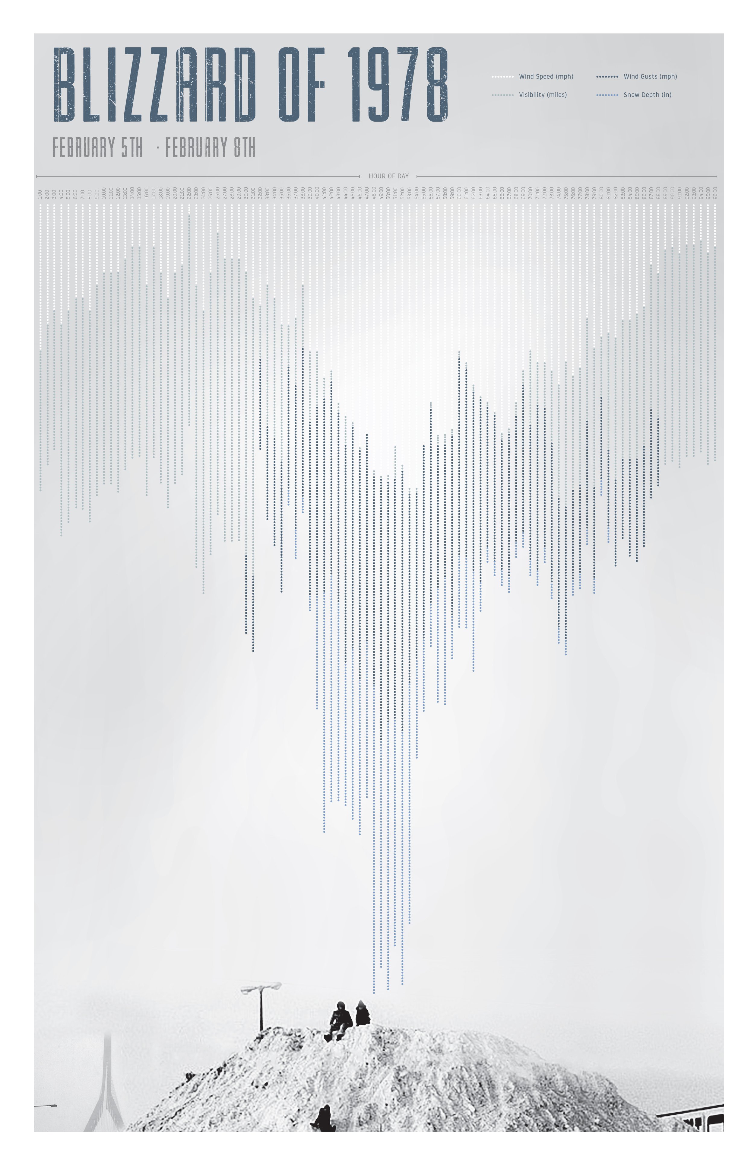
The intent of this project was to use data scraping knowledge to develop content for a visual narrative. I researched the Blizzard of ‘78 and pinpointed the flooding/water elevation during the peak of the storm, before and after. This ended up being a three-week data scrape to show the fluctuation in results.


+
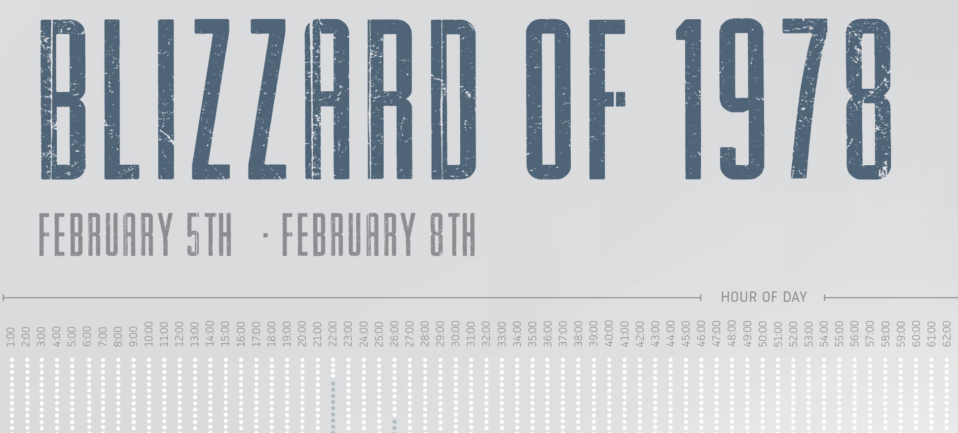
The keys are slightly hard to read from far away but this was intended. I wanted the legend to fall into the background. The visibility due to snow and rain was difficult during the blizzard and I took this and incorporated it into my design without sacrificing the narrative.

+
The linework is purposely dotted to reflect that of precipitation (rain and snow). The colors reflect those found from the image research to mimic a cool, cold and empty feeling.
